in shade
 |
| it was a sunny day . |
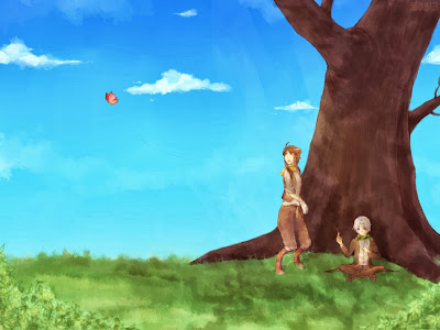
It was for Om Zerou. He wanted me to draw Seth and Ion. Both are his OCs in different RP groups. The concept in this drawing was a sibling-like situation, but it ended up like this... somehow.
Read more for WIPs.
 |
| A very first neat sketch. |
After I decided on one concept, I made a neat sketch and lined it. However, I realized that there was something wrong with the drawing, so I asked my sisters' and friends' comment. They pointed out what's wrong and what should I do to make this look drawing better.
 |
| There was quit a lot of changes, especially on the tree part. |
I'm used with coloring everything in one layer, since it helps to blend the colors. But in this piece, even though I used one layer too, somehow I couldn't blend at all. I was too afraid. T__T I was afraid that I'd ruin the drawing instead. So, using one layer only burdened me.... But I was too lazy to color in many layers. I tend to get confused if I use many layers.
Anyway, if someone ever wondered what I did here (too bad I don't have any pic to go along with it):
1. I lowered the background lineart to 50% opacity or so.
2. Filled the background color layer with the sky base color. Then made a gradient (dark blue-blue-blue green. The green was intended for the grass). After that I shaded the sky and colored the clouds.
3. Gave the tree a base color (on the same layer, though I think it's better to use different layer. It was a mistake to use one layer T__T), then shaded it. I filled the base color with 75% opacity pen. Did the same thing with the grass, except that I use even a lower opacity for the base color (since I already made a gradient for the grass at all).
4. Colored the background lineart with matching color. I don't think that we have to use darker color for lineart every time. I just use whatever color that goes along with my drawing(s).
I wasn't happy with the coloring, it didn't look real to me at all. I then looked at a lot of references (and tutorials!). Well, I should say it helped me. References and tutorials will always be my best friends.
 |
| Don't you think it's better? |
I don't know why, but it seems that something is wrong with google's/blogger's uploading service. The color of the grass shouldn't be THAT saturated. D'x Anyway, I finally colored the characters~ and the foreground too. Did the same steps as what I did with the background.
I don't have anymore WIPs to show, sorry. Man, I wish I had taken some more.... But then this post will be really long (lol).
This is not a tutorial or anything, this is just a work in progress pictures of mine. Thank you for taking a look! I hope this post entertains you.
Edit: It seems that there is something wrong with blogger's uploading service. T_T All the WIP images are in wrong colors--I'll try to upload it somewhere else and link it to here when I have time.


Comments
Post a Comment